Web Performance Workshop
by Diego Cardozo @ JSConfUY 2016
View the Project on GitHub diegocard/web-performance-workshop
Optimize images
Original image (1 MB)
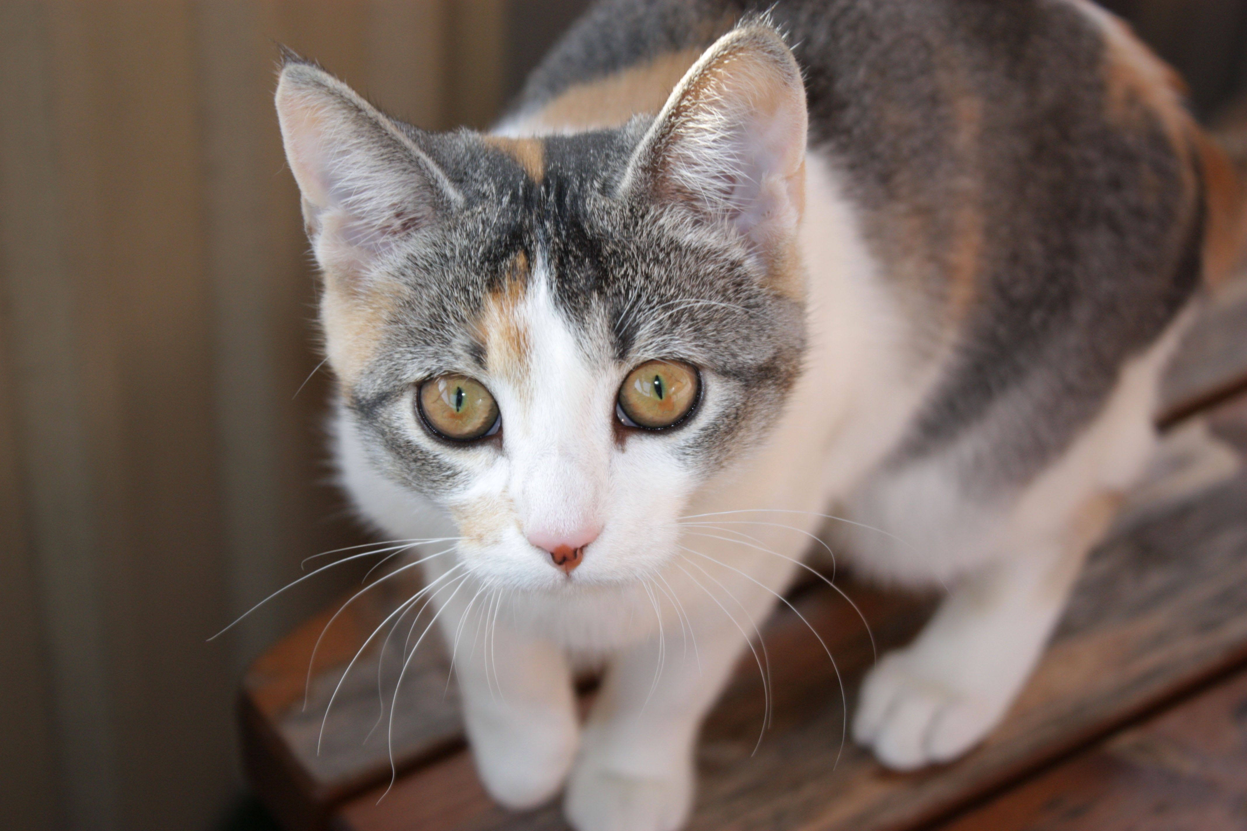
Let's start by resizing this image so that it fits the container.
- Identify the correct measurements using the browser's Dev Tools or pageweight.imgix.com
- Resize your image accordingly using any image editing tools or a service such as picresize.com
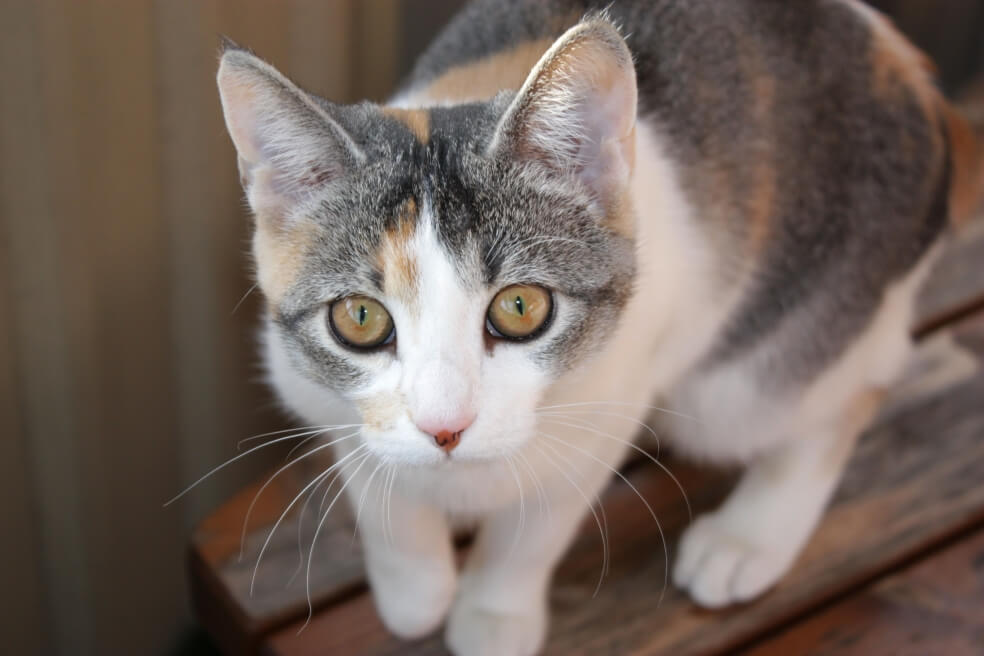
Resized (385 KB)

Now that the image is sized correctly, let's pass it through an image compressing service such as tinypng.com
Compressed (53 KB)
This is as far as we can go by using a single, static image. However, users with smaller devices such as smart phones will end up downloading an image that is bigger than their screen. Luckily we have some extra tricks up our sleeve. Enter the concept of responsive images.
Imager.js (depends on screen size)
<div class="delayed-image-load"
     data-src="images/step1/image-{width}.jpg"
     data-alt="Image of a cat, loaded by Imager.js">
</div>
new Imager({
    availableWidths: {
        768: 'small',
        992: 'medium',
        1200: 'large'
    }
});
Note: Breakpoints taken from Bootstrap's grid options
Native responsive images
We can take things one step further by using native responsive images. However, not all browsers support them.

| Chrome | Firefox | Safari | iOS Safari | Android Chrome | Edge | |
|---|---|---|---|---|---|---|
| picture | 47+ | 44+ | 9.1+ | 9.3+ | 49+ | 13+ |
| srcset | 47+ | 44+ | 9+ | 9.2+ | 49+ | 13+ |
More on responsive images here